EVE Online, the sci-fi MMO video game is well-known for being challenging to master due to its complexity and depth. When I joined the CCP Games’ web team, EVE Online’s web presence shared this complexity—but not in a good way! During my time as a Producer, Product Owner, and UX Designer working on this unique game, I made meaningful improvements, including pitching and leading the redesign of the flagship eveonline.com website.
Context
The website tried to cater to everyone, but in doing so, it failed to effectively meet the needs of any group.
To craft a new strategy for the game’s web presence, I started with a workshop involving key stakeholders across game development, marketing, customer support, business development, and web teams. One of the outcomes of the workshop was a plan to create a new version of eveonline.com that targeted new player acquisition and trial activation more effectively, shifting community and support content to a dedicated website.
For this portfolio, I’m focusing on the new eveonline.com website and my approach to UX design.
Goals
We established that eveonline.com would be the focal point for brand awareness and new player acquisition. Its primary purpose was to drive trial activation through regular updates from the marketing team, facilitated by a new content management system.
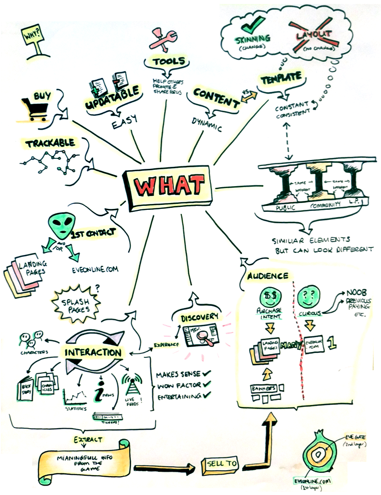
We set out to create a website that would fulfil this vision statement:
Eveonline.com is a website that offers and enables sharing the experience, immersion into and discovery of EVE Online through entertaining interactions. It conveys the emotions of the game experience and promotes the EVE Online brand to EVE curious people.
The Result
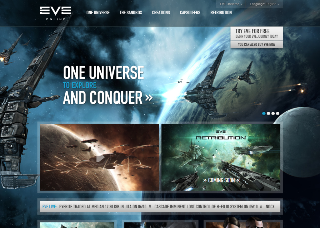
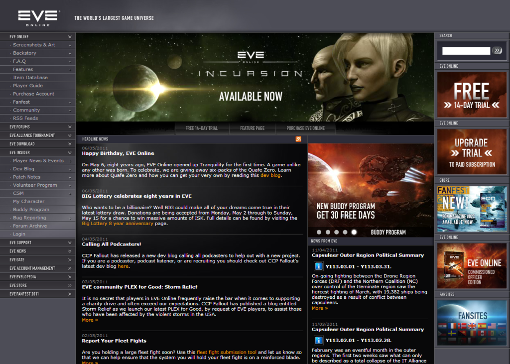
For reference, this is what the previous version looked like:
My Contributions
Gathering Ideas and Input
I initiated discussions about the goals for the new website during a workshop I designed and led with the leadership teams from Game Development, Marketing, Community, and Web. After establishing our vision and goals in the workshop, I facilitated brainstorming sessions to gather input and perspectives from the development team. It was during these sessions that we came up with the idea for an interactive starmap displaying live information from the game world, showcasing how alive and active the EVE universe truly is.
Creating Personas
As part of my research into how we might better serve our potential player audience, I crafted personas. While much of the data I used was anecdotal, I was able to incorporate what research we had from the marketing team. I created simple personas based on user needs, behaviors, and goals to ensure that the features we brainstormed would be valuable and to help us prioritize content. For instance, based on the “EVE Curious” persona, we prioritized making the sign-up process for a free game trial accessible and easy.
Wireframes and Content Strategy
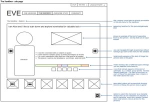
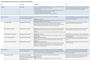
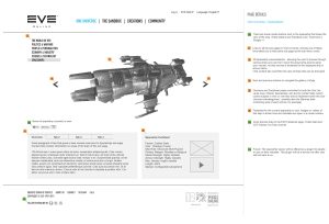
With a stack of ideas and my list of personas in hand, I began creating wireframes. Starting with low-fidelity mockups, I developed block-outs for critical content, functionality, and possible layouts. Alongside the wireframes, I drafted an outline of the page structure and content requirements to help our content writer in their research and writing. I used an iterative process to refine the wireframes further, gathering feedback and input from the team and project stakeholders to ensure the designs aligned with user needs and our goals for the new website.
Connecting Potential Players with Gameplay Options
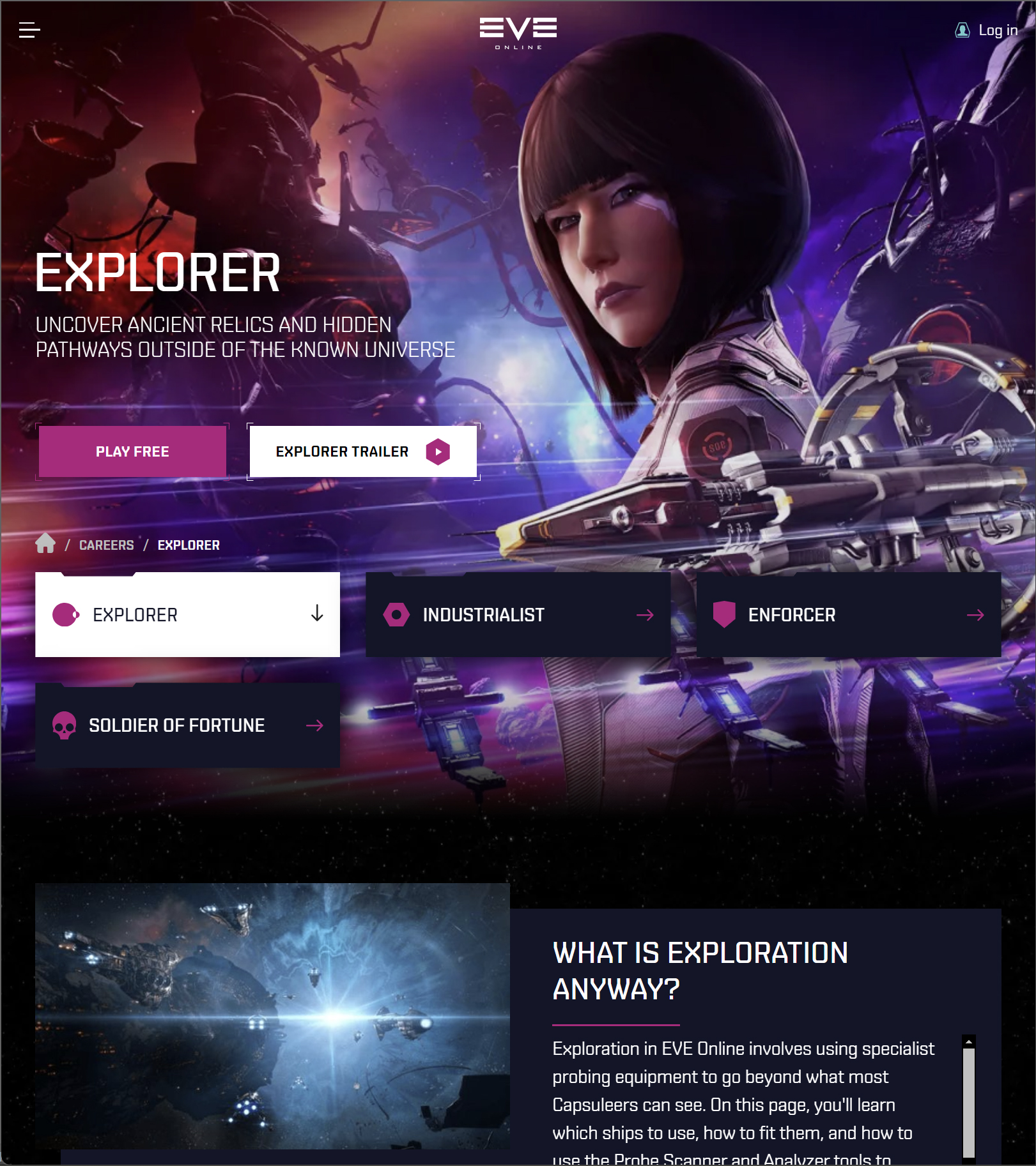
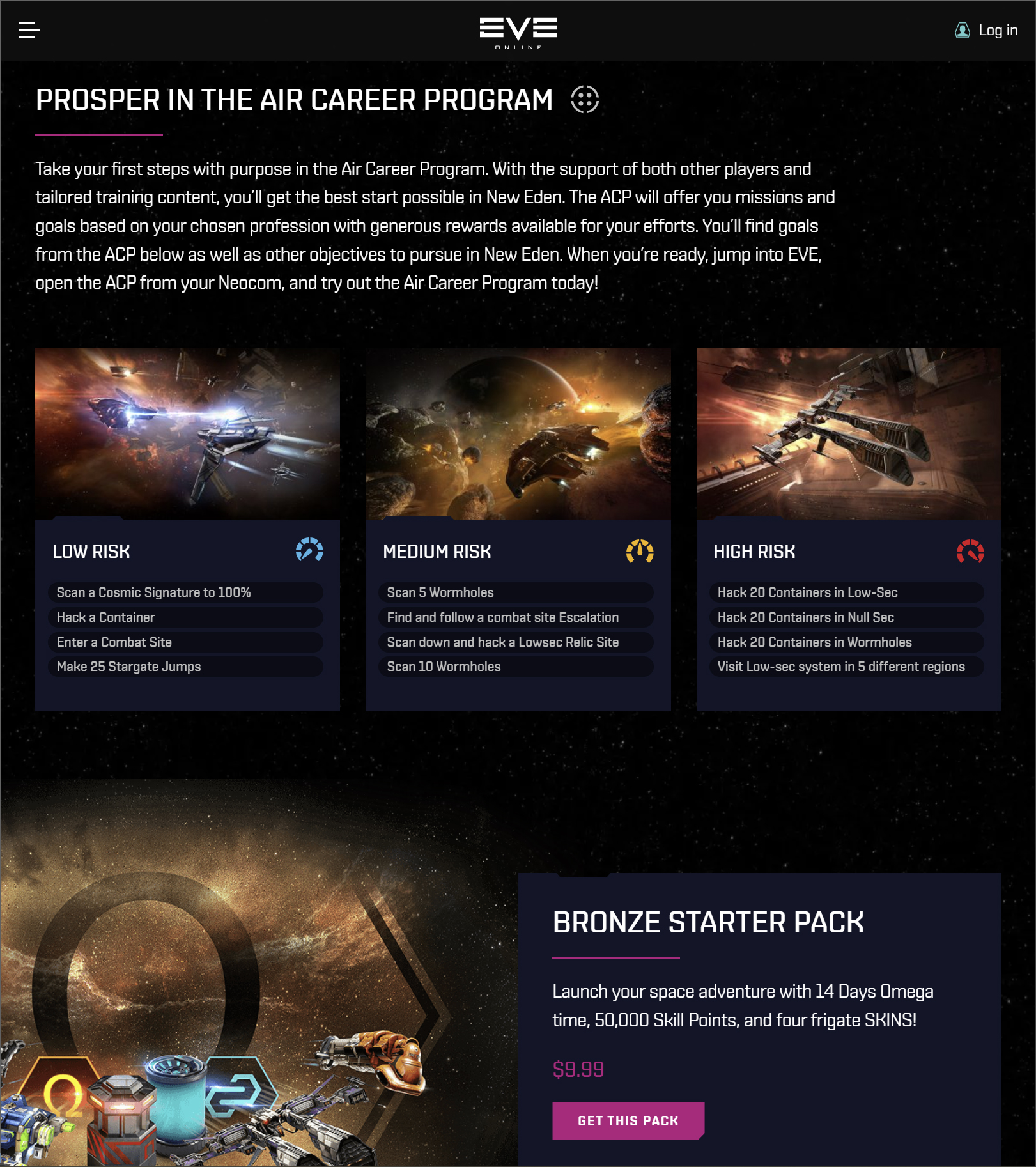
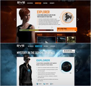
One main challenge in promoting the game was conveying to players that, although it’s a sandbox with unlimited gameplay options, certain activities could attract potential players seeking specific gameplay styles. Leveraging the success of the personas developed for our target audience, I proposed incorporating personas into the website to highlight the various gameplay styles available. I validated this hypothesis internally using wireframes, and with buy-in from all stakeholders, I integrated the idea into the website. We even created a simple quiz for players to help them discover which personas aligned with their preferences based on their responses.
This concept has persisted since my time with the team, becoming a key part of the new player experience in-game and continuing to evolve with each update. Here’s the Explorer career page today:
Using A/B Testing to Validate UI Design Choices
To launch with the optimal layout and color scheme, I collaborated with marketing to conduct multivariate A/B testing of advertisement landing pages. This testing helped us determine which combinations had the most significant impact on trial account acquisitions, allowing us to leverage the colors and layout that yielded the best results for the website.
Selling Change to Existing Players
To address potential concerns from existing players, I wrote regular developer blogs outlining the benefits and rationale for the changes and actively participated in the forums during and after the rollout. I also arranged a meeting with the EVE Online Player Council—a democratically elected group of players flown to Iceland annually for roundtable discussions on the game’s future—to share our plans, present our work in progress, and gather direct feedback. Overall, the changes were positively received within the community, and players appreciated having a website they could share with friends that better explained the game’s premise.
Amongst the flurry of additional requests and feedback, here’s what players had to say about the update:

Awesome! It is pretty clean and much less cluttered than compared to the older version. I like all the drop down menu options when you roll over the Tags. Keep up the good work!

Big improvements on the old website aesthetically, needs a few tweaks but I like the idea of the sandbox link with the different careers that one can become is a nice feature, simpler GUI’s explaining the game will allow CCP to attract more players.

The website is hugely impressive, congratulations. It makes me want to proudly show it to other MMO players to entice them into EVE.
